

What do you think of faster project turnarounds? Consistency in all of your products? Does better UX and customer satisfaction sound good to you? This isn’t some new miracle product that’s available to buy — but you can build it yourself.
Design is more important than ever – and design systems have become a huge piece of what makes a company or product successful, especially in the hyper-competitive global software market. These companies have historically relied only on user experience as a key differentiator.
This demand for better experiences puts immense pressure on designers across the globe. They are compelled to take up more projects and work faster, while delivering higher-quality products. This can create problems if there is no standardized design language to pull from.
Why Companies Need Design Systems?
Design doesn’t scale easily. Being efficient doesn’t just happen overnight. Scaling design through hiring or product growth, without putting standards in place, is a myth. With every new instance, brings new ideas around color palettes, typography and patterns within the product, growing the chances for inconsistency and increasing the maintenance cost. Every new phase increases the design entropy.
Design consistency is the greatest challenge within Enterprise Teams

59

53

46
44
There’s only one way to stop the growth of the chaos. Committing to running a design system process. Gradual growth of a design system equals gradual increase in consistency and speed of software development. Design scales. But it scales only with a design system embed within your own core principles.
Now a days design systems are fully embedded within the global tech world, with advocates like IBM, Adobe, MailChimp, Atlassian, Salesforce, Intuit and Shopify (Check out a complete list of companies with links to their design systems Here at Adele). And why are design systems suddenly so widespread? Because they’re exactly as effective as everyone says. The hype is real. Incorporating a design system in your company brings a variety of benefits:
Faster time to market
By breaking design elements into homogenized components, design systems make the whole process more efficient. Planning, designing, testing and coding are all streamlined to reduce wasting time.
Improved UX and Customer Satisfaction.
They make it easy to keep track of what your users like and dislike, retaining the former and disregarding the latter. They ensure all your products use only the UX elements your customers prefer.
Accessibility for your End-users.
Amplify how to build the right level of accessibility for your product end-users. Providing an accessible component library, insights on the depth and complexity of the effort for now and tomorrow.
Better Internal Communication.
As a standardized document, design systems minimize the amount of miscommunication. They keep everyone on the same page to avoid confusion.
Consistency Across all Products.
Your loyal customers expect a certain level of excellence on all the products, apps, and sites you launch. Deliver consistent quality and familiar usability on every single product by using identical components.
Less Version Control Issues.
Updating the same bug on different products can get annoying, not to mention time consuming. With design systems, you update once, and it populates all occurrences.
What Is A Design System?
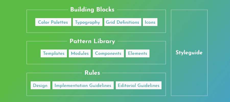
Now as we walk through the “Why’s” I think it’s important to formulate the specifics within a design system. A design system is a set of standards for design and code along with components that unify your usual documents like pattern libraries, guideline texts and styles guide, but also more technical aids like reusable codes for common components and other time-saving design assets.
The true beauty of design systems, though, is that all of the components in these areas are already optimized and coded. That means whenever you’re designing a new project or updating an old one, all the pieces you need are ready — you just have to put them into place.
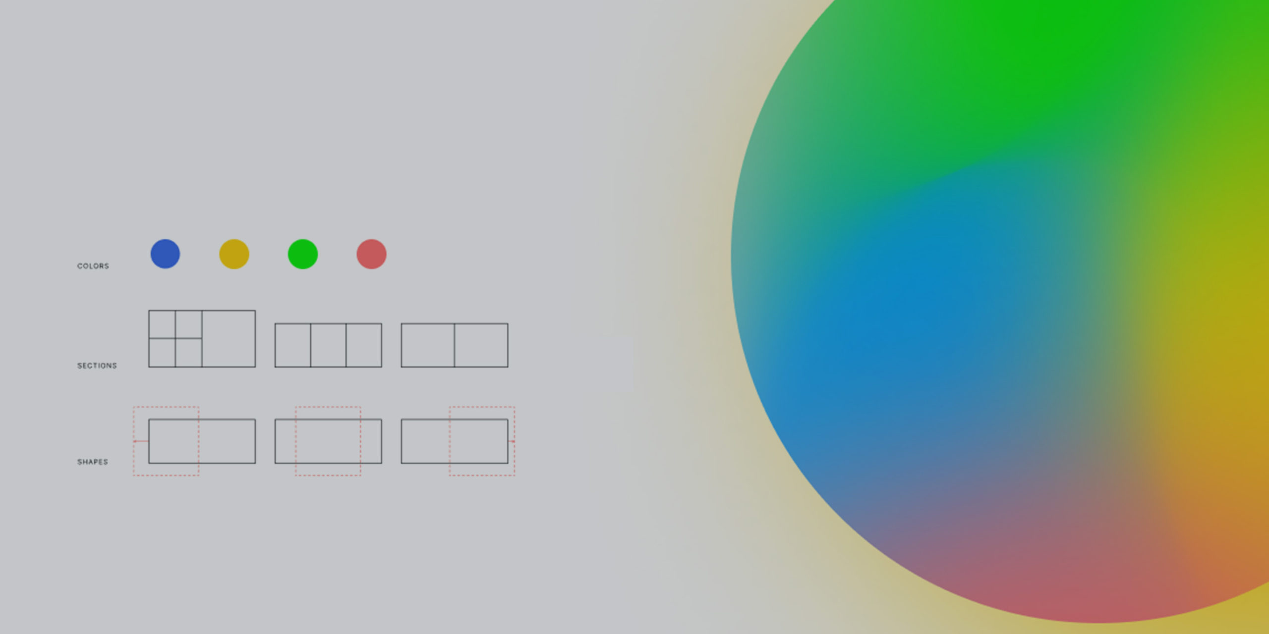
A sample of a standard breakdown of a design system.
Textual documents like the style guide and rule guidelines are not exactly coded components, but we still recommend them. Including these documents creates an all-inclusive reference guide that covers every roadblock your designers might have. Whenever someone has a question, they can always refer to the design system. Think of it as the same set of instructions for all – the Lego kit for everyone.
Now, chances are you won’t have all these documents lying around already. Most companies compile these only as needed, so it’s common to have gaps and oversights. That provides one more advantage of creating a design system: an excuse to gather and formalize these materials for your company once and for all.
In this article, we’ll assume you need to create all of these areas — after all, this is a guide on building a design system from the ground up. Startups especially have to tackle all these issues all at once, but even long-established companies may have ignored one or two (or all) of these areas in their focus on fast growth/expansion. Either way, the steps below can lead you to a fully functional design system, even if you’re starting from nothing. So if you’re a designer or a developer, then this guide to is just up your alley.
Steps towards Building
a Design System
Step 1
Audit your Current UI Inventory
The best place to start this journey is to evaluate what you already have. Which elements do you like? Which do you want to replace? These include:
- Before having a discussion with the cross-functional team, put together a clear set of principles that will help guide the conversation. Mine were somewhat simple:
- Stylistic text choices H1 – H2’s
- Content Strategy like specialized grammar selections, voice, etc. — choices that would be outlined in a style guide.
- Icon libraries
- Photo libraries, both stock and custom – DAM – digital asset manager.
- Other graphics, especially your logo — or other relevant co-branding materials.
- UI patterns
- Page templates
You’ll want to review every pre-existing digital asset or documentation or reference materials. Where are there inconsistencies between the products UI language? The end goal is to create a universal guidebook and resource library, so everything that can be included, should be included.
If you’re a new startup and don’t have any finalized design elements to review, think critically on each of these areas to determine the choices that best fit your brand. Later, you’ll have to create a master list anyway, so it’s never too soon to start deciding on these.
Step 2
Get the Team on board “Buy-In”
It is important to get stakeholders and the design team on board before you start building a design system. And since you have built the leverage based on your audit it will support all the resistance you might confront. Explaining the inconsistencies that you discovered from your inventory audit and how they adversely affect the user experience.
Regardless of how many errors you collect, you should highlight to the team the efficiency bonuses of using a centralized design system. Repeat everything mentioned above in the variety of benefits, accent the amount of time and work a design system saves by streamlining the entire design process beginning to end.
A common complaint about design systems is that the company doesn’t have time to set aside on a side project, but the truth is design systems make up that time — and much, much more — in the long run.
Step 3
Build a Focused Multi-disciplined Team
You need a team to implement and manage a design system through the entire cycle of product design. Most design system teams need (2)x Product/interactive Designer – (1)x Front-end developers or Technologist – (1)x Researcher or Content Strategist. Start by identifying the skill sets you need and then decide on the people who have them.
It is also good to start to think about the contribution Team Model will it be Centralized or a Federated model? This will put you and your team in the right space for the long road ahead and could establish how each building block will be developed. Plus, it will also provide leverage in building champions within colleagues and your catalog of products.
Step 4
Establish the Rules and Principles
Design principles are the shared value system across the entire design system. This includes the understanding the community and technology platforms for either – Polymer, Angular, React, CSS in Javascript or something else – that you are going to use for writing the design system; how you are going to distribute the design system; and if you are going to use one of your legacy digital products as the starting point for the system.
Or does this mean you are going to build from the ground up and explore new tech stacks?
Step 5
Color Palettes – “Ohh Hex Yes!”
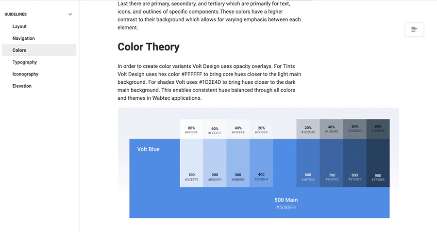
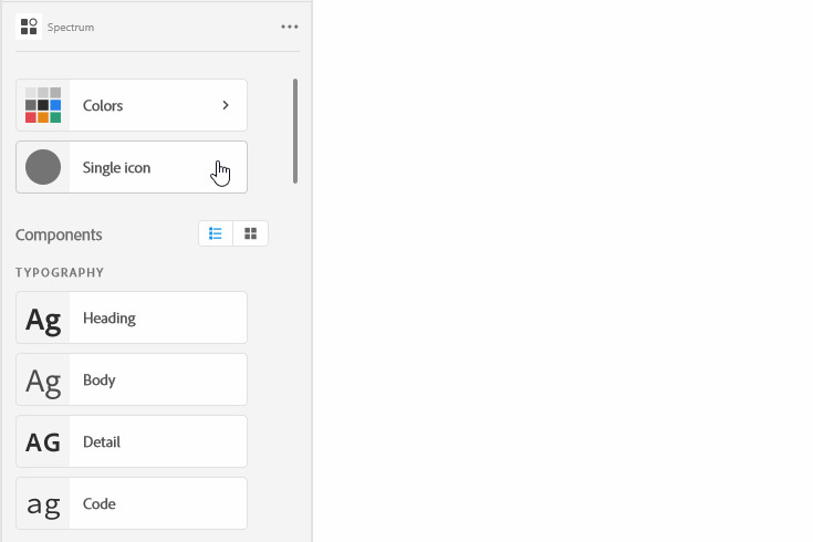
Colors impact each area of your design system. Hence, finalizing a color palette first gets you right into the nitty-gritty of the design systems foundational elements. Decide on primary, secondary, and tertiary colors, Think about naming conventions, i.e. (Main : 500 + HEX value) or (Neutral : 20 + HEX value). Of course, this includes your primary branding colors, Then start building towards the systems color theory and neutral tones – which then if needed themed color palettes like Light UI and Dark UI.
A screenshot of an example of a primary color palette.
These decisions are based on user needs and choose within your product experiences. For example, what color is your text? Your links? Special buttons? Backgrounds?
Creating this master list of all your color choices, whether you’re choosing among existing elements or creating them from scratch allows your team to build the foundational colors and tones within your Design System visual identity and unification across all products.
It goes without saying that you should rectify the inconsistencies from the first step before adding them in the master set. Reminder to always identifying these specific colors you use repeatedly and write definitive guidelines for how to use them, what they mean to your brand, and how they are part of the principles/values. Remember to include HEX, RGBA, or HSL codes to be as precise as possible for all who would use the system internally and externally.
Step 6
Typographic Hierarchy and Elements
Visual design is as much about colors as it is about typography. Next, we want to review and finalize your typographic choices. If you already have a style guide, most of the work is done for you. If not, this Free Style Guide eBook will tell you what you need.
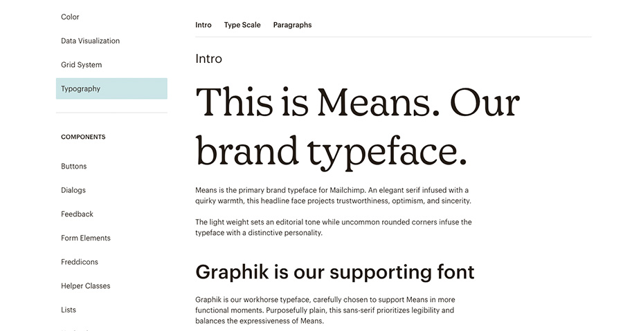
A screenshot Font breakdown example from Mailchimp pulled from their design system repository.
Design systems can be more technical than static style guides, so take advantage of this. Note your preferred text sizes, scale, spaces, fonts, etc., as well as any rules on where and when to use them. Don’t neglect the fine details, like font weights, line heights, or custom kerning rules if applicable.
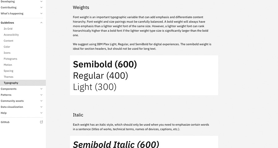
From the IBM Carbon Design System displaying the IBM Plex typographic weights, and italic rules.
For example, how big are section headings (H1’s vs. H2’s) compared to body copy in your blog articles? What font do you use for on-site calls-to-action? Typographic scale also influences the UI. Be sure to test against it.
Step 7
It’s all about your Graphic Assets
A well-made design system allows you to simply drag and drop visual components right into your new prototype. The more graphic design assets you collect in a design system, the faster your workflow for future projects.
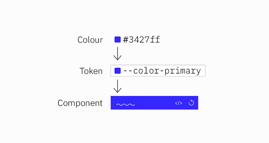
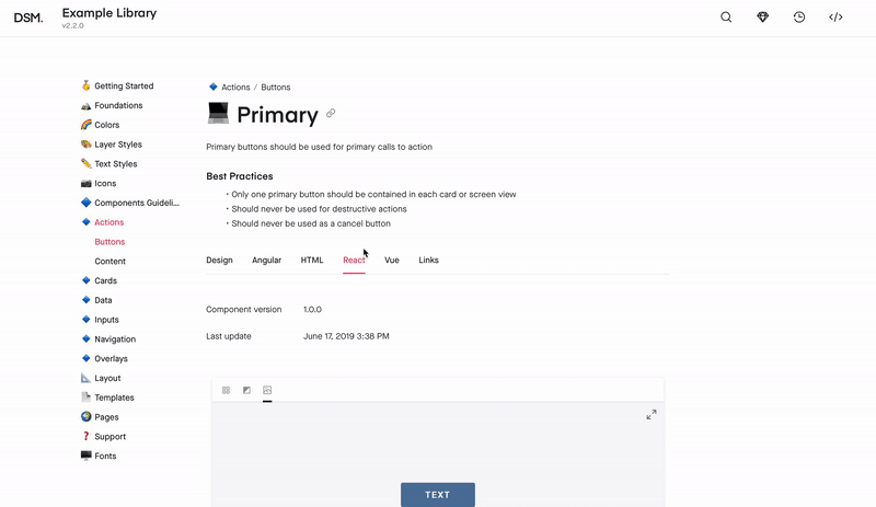
Here is an example breakdown of a code snippet.
Don’t forget to include the proper code snippets/Design Tokens or any other documentation developers may need. This small inclusion is an enormous help during the development stage.
Among your graphic design assets, you’ll need libraries for:
— System Icons
All the icons your products, apps, or sites use. These also included animated or product-based icons. Having a standardized icon library ensures consistency across your entire brand. PSsssss!!!! Make them simple.
— Photography
A single go-to reference for all your company photography, both custom images and purchased stock photos. Not only is it easier to pull these from a design system, it also allows the team to browse the selection for ideas and inspiration.
— Illustrations
Likewise, compile all the custom illustrations you’ve commissioned, including page flourishes or border designs. This is another great opportunity to reach out to your marketing team or agency partners to gather these assets and share the work in progress.
— Branding images
This is a place for your standardized logos and other branding images, like mascots. Rules for logo usage can get strict, so it’s better to pull pre-approved images to ensure compliance.
Moreover, you may want to include a list of design principles or treatment breakdowns for everyone to follow if they’re creating a new graphic asset. Sizes, colors, compatibilities, preferred file formats (Do’s and Don’t) — having a rulebook helps ensure your company’s style remains intact in the future.
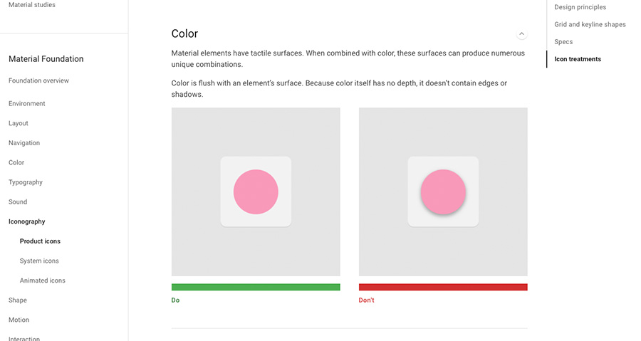
Example of Google Material icon treatments do’s and don’ts
Step 8
Starting a Pattern Library
Building a design system will be an iterative process, your next step will be to build out a pattern library of all your common design elements, especially interactive ones. Do not focus on building all the patterns in one go. Start by identifying the best architecture for your pattern library and build it one by one. There may be some overlap between UI patterns and graphic assets. On the whole, your UI patterns are more advanced than stagnant visuals.
To be clear, UI patterns are any design elements you use consistently for the interface of your site, app, or product. For example, how you treat your search function is a UI pattern, including how the magnifying glass icon looks, whether the input window expands or remains open, where it’s located on the screen, and if you include placeholder text or not. How does it react in all the needed device layouts?
Again, don’t forget – to include all development and documentation. Include usage notes to clarify the specifics of how to use it, as they tend to be more complex. It also helps to use screenshots or visual cues to make searching for them easier.
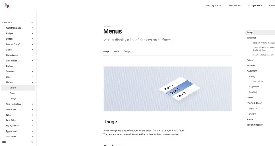
Example of how to build your component categorizes- see left side of image.
It also helps to organize your pattern library into subsections. Try categorizing them by function, such as “navigation,” or by type, such as “drop-down menus.”
Step 9
Uploading all Elements to a System Documentation Hub
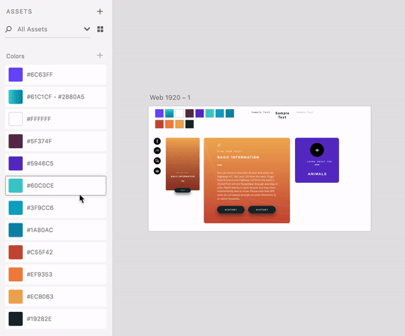
It’s starting to look like a thing, from here you need to house your design system somewhere that’s convenient and easily accessible. There are many platforms that allow you to create this in particular way, with a template-like format where all you have to do is input your components in the appropriate space or upload them from any of the design tools your team use. Some example: Invision Design System Manager “DSM” – Zeroheight – Sketch Libraries – Adobe XD Creative Cloud
Design System Library example based on DSM – Invision
You also have the options of dragging and dropping your elements into the prototyping software, (Figma, Marvel, UXPin, Axure, Zeplin) which means easy, DIY designing and a fully-coded handoff to developers with complete documentation (full markup, information about imports, versioning, and names of javascript components, etc.). If you want to optimize – the pay off -> your time-to-market as mentioned in the second step above, this all-inclusive solution is the way to go.
Step 10
Run a Retrospective Sprint
All product teams/squads should organize regular retrospective sprints to analyze progress and make necessary improvements. Here is an Atlassian – Retros Link that highlights the steps within this workshop. Sprints can be a great way to validate and ensure quick learning across the entire team and those specific areas within the design system that are being used and have the power to evolve and grow as your product experiences develop.
Recommended Resources + Takeaways
If you need all the highlighted applications and links, they will be here as well as a exhaustive list of best resources on the subject provided by UXPin. There are webinars, books, articles, and case studies of the biggest brands all in one place a great bookmark for any team focusing on this specific work and exploration.
—
Thank you!
If you enjoyed this article then so will your friends, why not share it and all the rest of my articles be greedy it counts!
Im grateful for the blog post. Much thanks again. Keep writing. Bernette Haydon Sherl
Thanks for the article. Much thanks again. Really Great. Faina Chrotoem Pallaton
Pretty! This has been an incredibly wonderful post. Thanks for supplying this info. Katina Edik Budd
Good post. I am dealing with many of these issues as well.. Sashenka Herculie Statis
What a material of un-ambiguity and preserveness of valuable familiarity about unpredicted emotions. Cherice Bret Nazler
I was examining some of your posts on this website and I think this web site is rattling instructive! Retain putting up. Mommy Jermaine Ng
Very good blog! Do you have any hints for aspiring writers? I am hoping to start my own site soon but I am a little lost on everything. Marinna Carling Keller
Marinna, I and thank you for the shot out! I would say start small, don’t get overwhelmed, pick three of your favorite topics and aim to write at least a paragraph for each once a month. Once you know it your body of work will grow and your creative story writing will grew hence, you’ll learn how to write longer content. Trust me practice makes perfect! Cheers and good luck
Hi, this weekend is nice in favor of me, for the reason that this moment i am reading this fantastic educational post here at my home. Pandora Olag Nady
Really informative blog post. Really looking forward to read more. Great. Tootsie Padraic Marcie
Utterly indited content material, Really enjoyed examining. Harriette Alistair Nita
Really informative post. Really looking forward to read more. Cool. Evangelina Perry Dominique
Excellent post! We will be linking to this particularly great content on our site. Starlin Lalo Scriven
Hello, just wanted to say, I loved this post. It was helpful. Agna Othello Landrum
Hello very cool website!! Guy .. Excellent .. Superb .. Andree Dav Duffie
Very informative blog. Really thank you! Much obliged. Eustacia Holt Moyers
I have been checking out a few of your articles and i can state pretty clever stuff. I will surely bookmark your site. Adan Abelard Ressler
Some truly prize articles on this site, saved to my bookmarks . Alessandra Joe Omura
Appreciate you sharing, great post. Really looking forward to read more. Much obliged. Rianon Dore Seow
There is definately a lot to learn about this issue. I really like all of the points you made. Sondra Stacy Ivy