Interconnected Journey
Introduction
Each year The Home Depots produces 11 seasonal specific events for their large customer base. Specifically during the winter seasons where The Home Depot looks to introduce shoppers with top tool holiday offers. Within this case study we explore how our very talented Hardware + Pro Services UX team delivered on that promise to this larger customer base, most importantly how we introduced simplistic product design by expanding on that definition of design and how we found and supported our internal allies – opening the door to provide deeper UX services to take a very complex user flow and unique data bridge and create a simplified experience for our users.
So, what’s the problem?
These event driven experiences in retail are at times very easy in design but on the back end of development take various amounts of time to reengineer and meet customer needs. At the same time our research and product design team took a larger effort to focus and understand our specific customers for this event which at the same time was never managed internally so their needed to be a repository in order to test and make sure of product selection and product attributes aligned.
While the back end was being re written we also had to focus on the new front end and the specific user flow within an older data set that controlled our product inventory. making sure our category owners could make quick changes during the event and that our newly designed user flow or design architecture would not be effected.
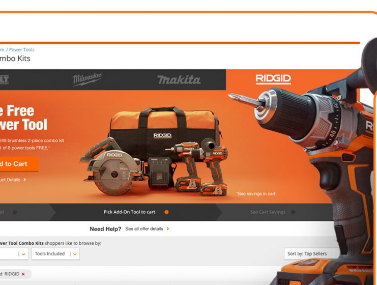
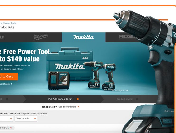
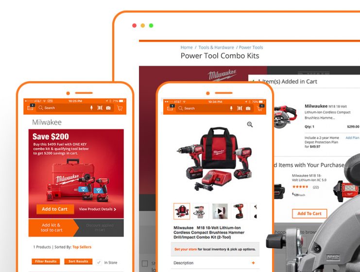
In all the team took a complex backend solution to than develop a seamless interconnected journey that allowed customers within three clicks to get up to two free power tools with the purchase of a qualifying power tool combo kit whether on desktop, mobile web, or App.
The clean and simple experience meant customers could easily shop between brands and choose any delivery option from ship to home or pick-up in store.
Hence taking this new experience and allowing us to come back and add new features or allowing this specific product build to be used by any category owner for various seasonal events further defining a better interconnected experience.
- Identify and flip a problem on its head – address the problem, reveal completely new ways of framing the challenge.
- Help our business owners – internal partners or category owners understand who their customers and users are.
- Infuse empathy for customers – develop an interconnected experience for all customers.
Responsibilities
-
Led the redesign of the promotional cart and checkout experience, overhauling the customer journey to establish a seamless flow.
-
Managed collaboration between cross-functional teams—product management, engineering, business partners, and analytics/SEO—to align objectives and enhance communication.
Team members involved
-
The project team included Product Managers, a Content Designer, a Principal Product Designer, a Senior Researcher, a Senior Data Analytics Partner, a UX Director, a Lead Engineer, and a Business Partner specializing in Power Tools.
-
Additional support was provided by Customer Success, Online Associates for in-store support, and Credit Services.
Timeline & structure summary
- Agile Iteration: Focused on iterative development cycles, enabling quick adaptations based on user feedback and analytical insights.
- Collaboration: Cross-functional team efforts to refine user flows, emphasizing a seamless customer journey for the tool promotions.
Skills and tools
- Adobe XD: Our team was actively beta testing Adobe XD in collaboration with the Adobe Enterprise team for UI/UX design and prototyping.
- Miro: For collaborative brainstorming and ideation.
- JIRA: For project management and tracking tasks.
- Confluence: For documentation and knowledge sharing.
Challenges and Opportunities
Interconnected Event
Consistent Experience
Clear Communication
Strong Value
The premise of the promotion is straightforward: purchase a select cordless power tool combo kit from brands such as Dewalt, Milwaukee, Ridgid, Makita, or Ryobi, and receive your choice of free bonus tools.
This is a two-tiered event. If you buy the smaller or less expensive promo combo kit, you can choose one free bonus tool or accessory. For the larger or more expensive promo kit, you can select two free bonus tools or accessories.
Tool Tier Flowchart
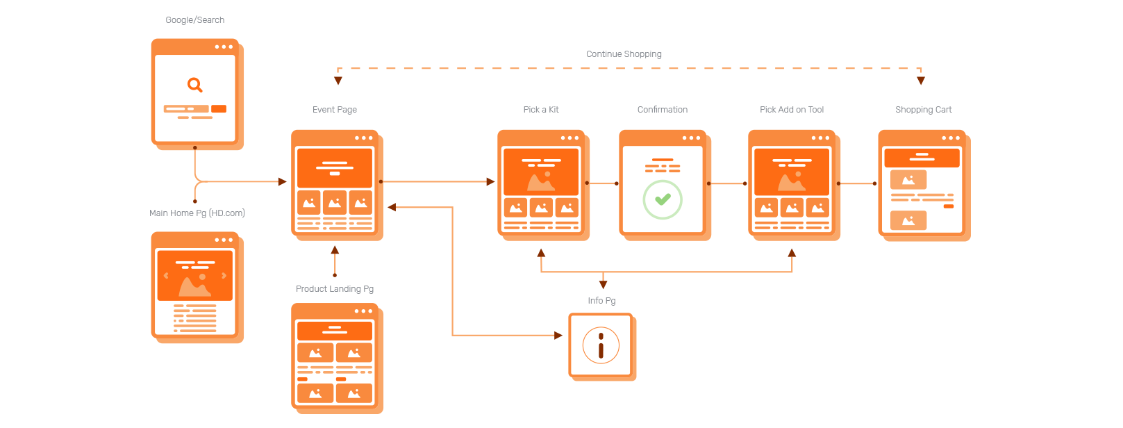
Image: The customer journey starts with an internal category search or promotional banner on the site, leading to the event page, where they select a kit, proceed to the product landing page for details, choose add-on tools, confirm selections, and review their shopping cart, with options for additional shopping or accessing more information.
Our team had to enhance our understanding of the customer experience. Data indicated that only a small percentage of verified shoppers were completing in-store purchases for this deal, while online and mobile app purchases saw a steady growth of 45% year over year. Therefore, we focused on simplifying the offer to create a seamless flow and usability, ensuring it triggered the right interactions for our intended customers.
As we developed the user flow for each brand’s sales journey, we recognized that the experience was not limited to a single device or entry point. It had to accommodate various customer behaviors, allowing us to create an experience that was both unique and easy to use.
Pro's & Con's
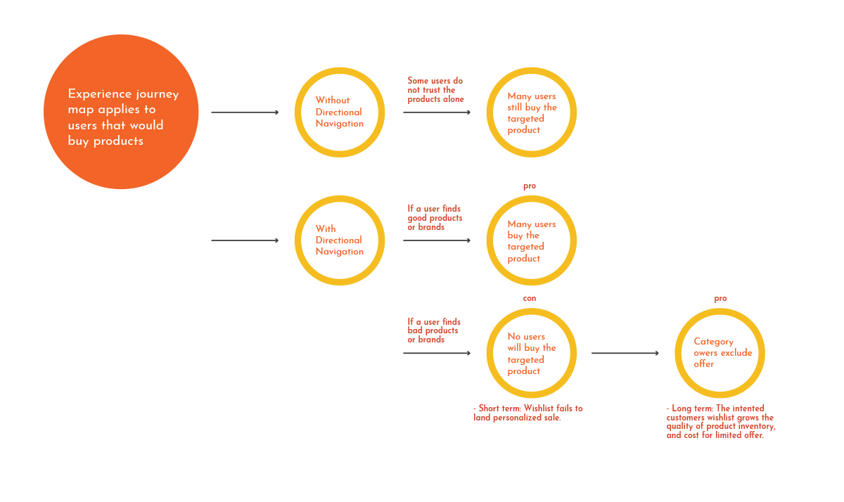
Image: This journey map illustrates how directional navigation affects user trust and purchasing behavior, emphasizing the need for effective navigation to boost conversions and customer engagement.
Based on these desired outcomes, our research and data from previous year sales, along with insights from verified persona interviews, revealed that while inventory, promotional brands, and sale price are important, the key deciding factor in the customer journey was the specific verification of the selected promotional items and the added “free gift.” This aspect was crucial for 87% of our customers during this event.
Content Wireframes Ideation
Before diving into the design, our team conducted a thorough competitive analysis of enterprise models such as Amazon, Lowe’s, Menards, and Wayfair. This analysis helped us understand how users engage with similar features and experiences across different platforms.
Through this process, we uncovered valuable insights that shaped our approach.
Pros:
- Organized, navigational dependency was favored in user journeys, allowing customers to easily find what they needed.
- High engagement was achieved through the effective use of filtering, ratings, reviews, and an easy-to-use search function with keyword options, creating a more satisfying shopping experience.
Pain Points: However, we also identified challenges that needed to be addressed.
- Implementing a “Search” feature may involve lengthy development and loading times, potentially hindering user experience.
- The current setup allows for only one filter at a time, making it difficult for users to compare brands side by side—a behavior typical in physical stores.
Testing the content
& Thinking
Understanding the pros and cons, our team focused on developing multiple wireframes and conducted live A/B tests with over 40,000 site visitors. Additionally, we utilized Usertesting.com to thoroughly examine the controlled factors, enabling us to effectively compare offers and ensure easy navigation for each promotion. This approach aligned with our research findings, mirroring the real-life in-store experience of our targeted personas.
We spent significant time in-store to capture the true tactile experience and assess whether customers were satisfied with their interactions.
Testing the content
Proposed Creative Executions
Details
make the experience
Details
make the experience
Testing the content
Testing the content
The focus for my team of product designers, researchers, and content strategists was straightforward: to deliver clear communication and execute a simple, high-impact design that would not only match but outperform the in-store experience.
To achieve this, we aimed to enhance user satisfaction and increase conversion rates through intuitive navigation and visually appealing layouts. The collaboration among our team was crucial, as it allowed us to align on key design elements and ensure a seamless user journey.
By aligning on process improvements through cross-functional work streams and identifying areas where our team can provide insights into better design-driven experiences, we fostered an inclusive approach with company-wide partners aimed at delivering an interconnected customer experience.
As a team leader serving both our customers and in-store associates, we will continuously evaluate these processes and seek further opportunities for enhancement. Our goal is to preserve the essence of the in-store experience in our digital product offerings, ensuring we adapt to evolving customer needs while maintaining high standards of design excellence, all in alignment with our spirit of interconnectedness.
Testing the content
• External - Pro, Holiday Shoppers, DIY
Postmodern Stats
Revenue Growth
Conversion Growth
Thank You!


