
Interconnected Journey
Introduction
Each year The Home Depots produces 11 seasonal specific events for their large customer base. Specifically during the winter seasons where The Home Depot looks to introduce shoppers with top tool holiday offers. Within this case study we explore how our very talented Hardware + Pro Services UX team delivered on that promise to this larger customer base, most importantly how we introduced simplistic product design by expanding on that definition of design and how we found and supported our internal allies – opening the door to provide deeper UX services to take a very complex user flow and unique data bridge and create a simplified experience for our users.
So, what’s the problem?
These event driven experiences in retail are at times very easy in design but on the back end of development take various amounts of time to reengineer and meet customer needs. At the same time our research and product design team took a larger effort to focus and understand our specific customers for this event which at the same time was never managed internally so their needed to be a repository in order to test and make sure of product selection and product attributes aligned.
While the back end was being re written we also had to focus on the new front end and the specific user flow within an older data set that controlled our product inventory. making sure our category owners could make quick changes during the event and that our newly designed user flow or design architecture would not be effected.
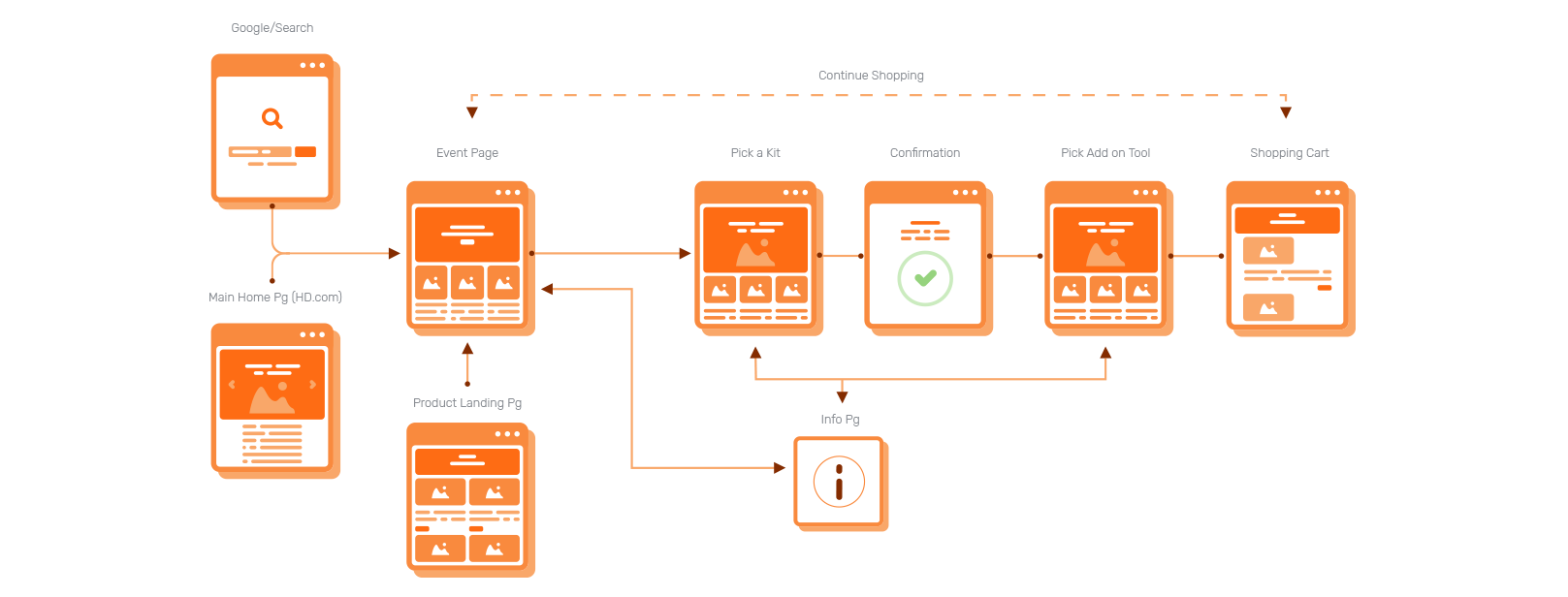
In all the team took a complex backend solution to than develop a seamless interconnected journey that allowed customers within three clicks to get up to two free power tools with the purchase of a qualifying power tool combo kit whether on desktop, mobile web, or App.
The clean and simple experience meant customers could easily shop between brands and choose any delivery option from ship to home or pick-up in store.
Hence taking this new experience and allowing us to come back and add new features or allowing this specific product build to be used by any category owner for various seasonal events further defining a better interconnected experience.
- Identify and flip a problem on its head – address the problem, reveal completely new ways of framing the challenge.
- Help our business owners – internal partners or category owners understand who their customers and users are.
- Infuse empathy for customers – develop an interconnected experience for all customers.
Challenges and Opportunities
Interconnected Event
Consistent Experience
Clear Communication
Strong Value
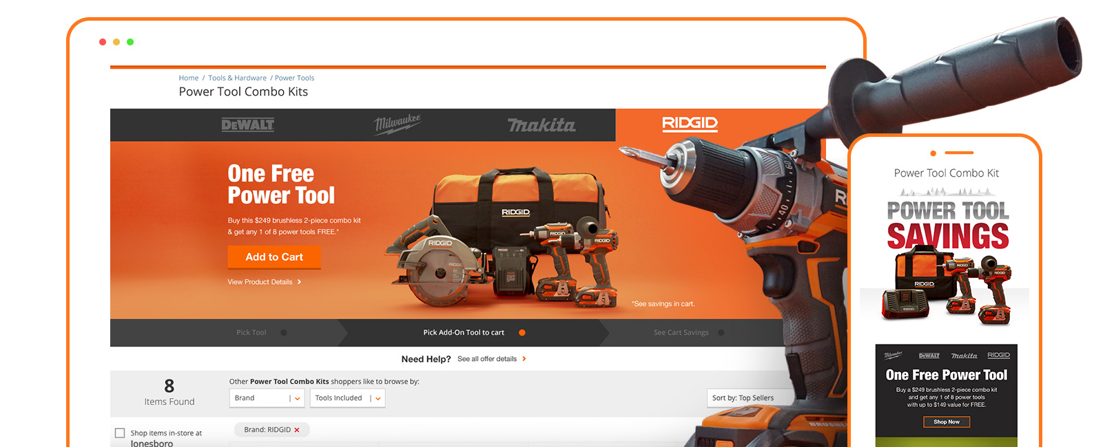
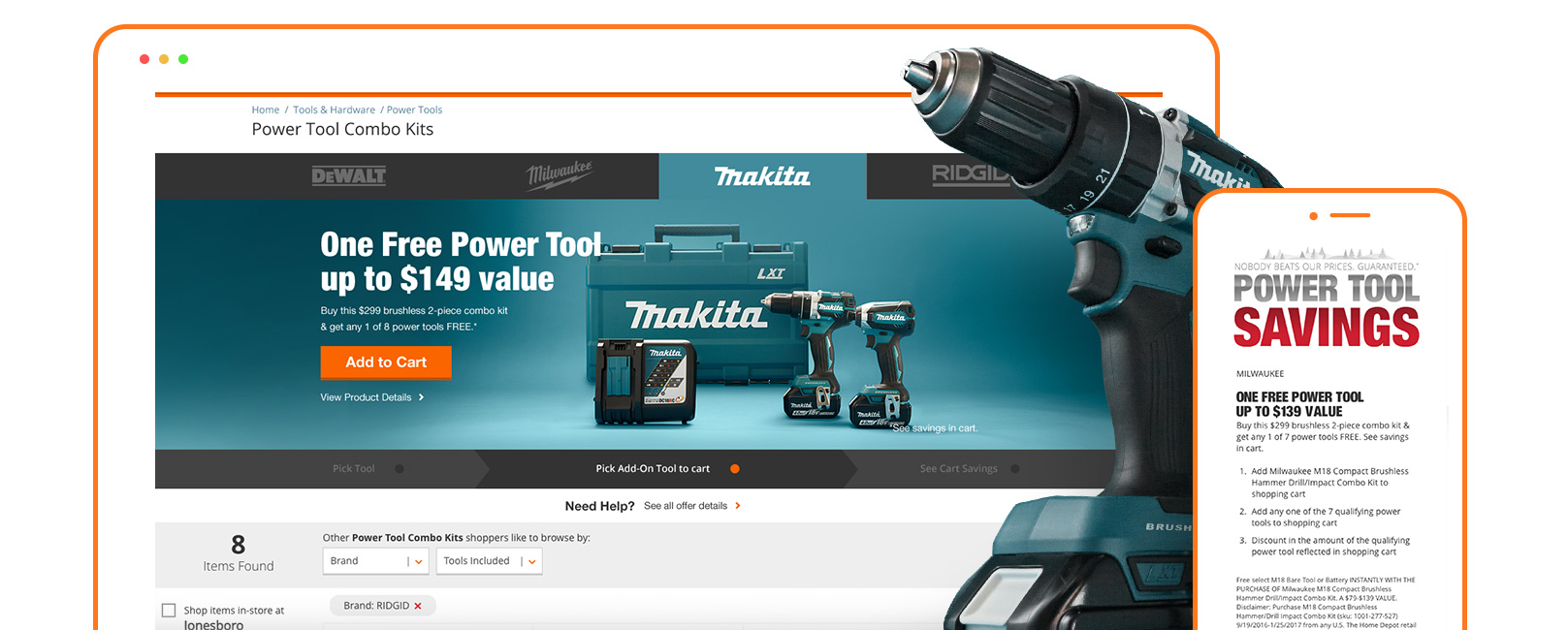
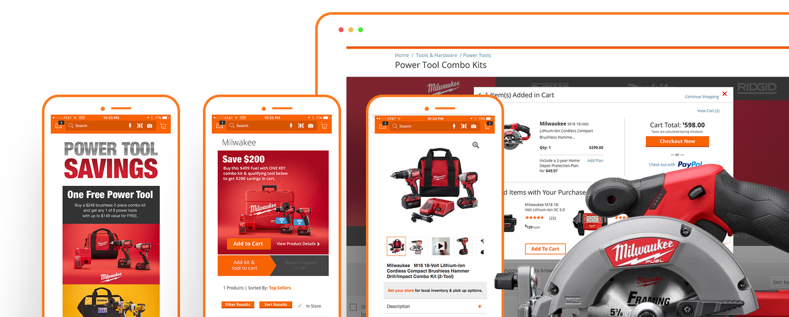
The premise of the promo is simple – buy a select cordless power tool combo kit by either brand: Dewalt, Milwaukee, Ridgid, Makita, or Ryobi, and get your choice of free bonus tools.
This is a 2-tiered event. Buy the smaller or less expensive promo combo kit, and you can choose (1) one free bonus tool or accessory. Buy the larger or more expensive promo kit, and you can choose from (2) two free bonus tools or accessories.
Tool Tier Flowchart
1
Mobile hero would be built differently, with just one extra click due to functionality within the hero space
2
The “Pick the add on Tool” step, would be a specifically built in custom Product Landing Page (PLP) for each of the four brands
So here is where my team had to stretch their ability to fully understand the customer experience. We understood based on data, that only a small percentage of verified shoppers were actually purchasing or following through on this deal via in-store. The majority year over year was a steady growth of 45% more buy in online and via the mobile app, so we had to double down on simplifying this relatively simple offer and make it seamless in flow and usability, all while triggering the right interaction buy our intended customers.
So while our team built out the user flow for each of the sale brand journeys we had to understand that the journey was not only targeted from one device or entry point but would and could carry through various customer behaviors that we would need to identify in order to make the experience unique but also just simple to use.
Pro's & Con's
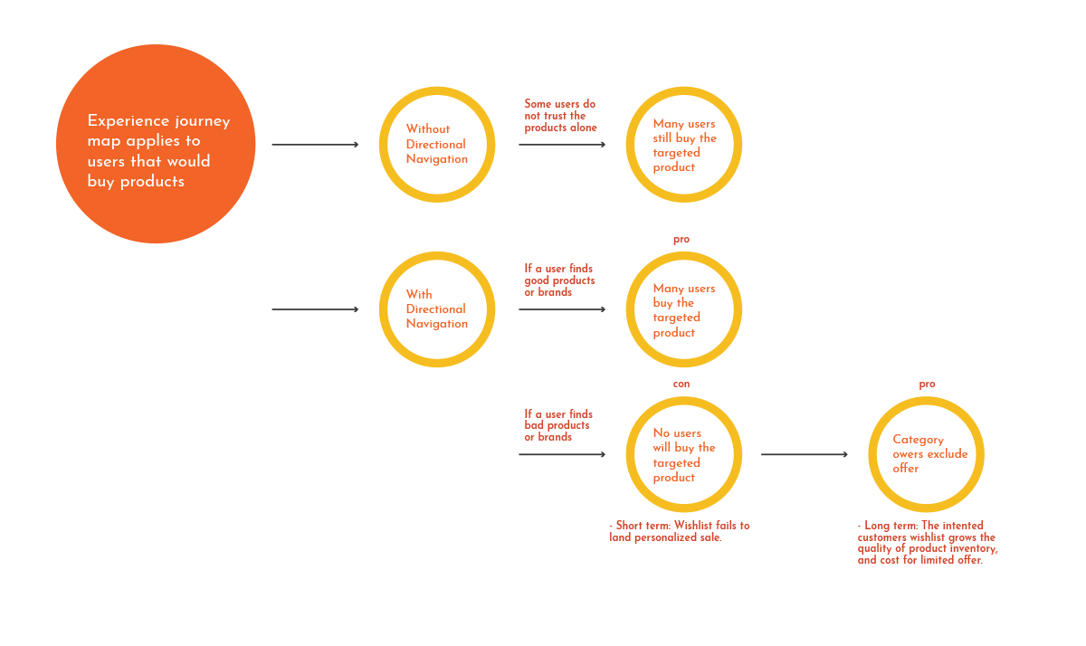
Based on these desired outcomes we also had the data based on our Research and implementation from previous year sales and verified personas interviewed that not only inventory or promotional brands or sale price was a deciding factor in the journey, most importantly was the specific verification within the selected promotional item and the added “Free gift”, that really mattered to 87% of our customers during this event/experience.
Content Wireframes Ideation
Before our team started to dive into the design, we went through a thorough competitive analysis with competing enterprise models like Amazon – Lowe’s – Menards – Wayfair to further understand some of these funnels from a larger audience base- how a user would approach feature and journed experiences similar to ours.
Pros: Organized, navigational dependency – was most liked within all journeys or or engaged experiences Reviews. The use of Filtering, Ratings, Reviews, and easy Search with Keywords or tab where all nice to haves.
Pain Points: Adding a “Search” feature may take too long to build/load, Only 1 filter or ability to compare brands side by side made things hard to explore and compare similar to what a person in-store would actually do.

So understanding the Pros and Cons, our team doubled down on multiple wireframes and tested these theories via live A & B tests with over 40,000 site visitors and we also used Usertesting.com on a compressed matter to fully dive into these controlled factors to specifically monitor the control of comparing offers and also providing easy navigation to navigate per each promotion, similar to what our research identified in a real life in-store experience with each of our specific persona base.
Yes we spent a lot of time in the store, it really came down to were we really capturing the true touch and feel experience and was our customer leaving that moment satisfied.
Proposed Creative Executions
The focus here for my team of product designers, researchers, and content strategist, was simple and straight forward. We had to deliverer clear communication and a simple and easy execution in order for this high impact experience to match and over perform an in-store experience.
Both aligning on how to improve processes with cross functional work streams and identify areas where our team could provide insight of better design driven experiences throughout the company. This all providing an inclusive process with company-wide partners to deliver on an interconnected customer experience.
Postmodern Stats
Combined increases based on Mobile and Desktop metrics
Revenue Growth
Conversion Growth
Thank You!


